Hi Everyone, I have officially moved my blog to andreajohnsondesign.com/blog. I will see you over at my new digs! Happy Friday and I hope everyone has a great Mothers's Day!
Friday, May 11, 2012
Wednesday, May 2, 2012
Dreaming of free standing tubs
I'm in the process of sourcing and pricing all the materials needed for my bathroom reno. The original plan was to keep the tub and work around it by adding some wood detail to the apron and new tile for the top as well as replacing the water jet covers, the water jet panel and the faucet. My goal was to keep the cost down by making my twenty year old tub look as pretty as possible. Once I added up the cost to make all these changes it got me thinking about free standing tubs and possibly finding a good deal. I don't know if I'm interested in putting lipstick on a pig if there isn't any significant cost savings. Keep in mind that the labour and plumbing fixtures for free standing tubs can really add up so do your research. I'm on the hunt and hoping to find a good deal so wish me luck!
The Greenwich Hotel via Decor Pad
Friday, April 27, 2012
Thursday, April 26, 2012
Pinterest inspiration
I came across this image on Pinterest and fell in love with this tile floor. Yes, I said TILE! It's a tile that looks like wood. It comes in beautiful shades of either grey, brown or a white washed look. I have added it to my short list as an option for my ensuite bath. It will cost less in labour to install than stone and also be extremely durable and very low maintenance. I also love that I could lay it in a herringbone pattern as it comes in either a 6x36 or 9x36 tile. Everyone needs a little herringbone in their life, don't you think??
Tuesday, April 24, 2012
Time to make some changes
I'm saying goodbye to From My Living Room and I am in the process of moving my blog over to my website at Andrea Johnson Design. I have met so many people through this little blog that I started in 2010 and I hope that will continue. It just makes sense to have both my website and my blog all in the same place. In the process I will be losing Google Friend Connect and all you wonderful followers that have supported me from the beginning. To make this transition a little easier I have already added a new bloglovin' button to my current blog and you can continue to follow me once I move over to Andrea Johnson Design. So if you love me then show me some bloglovin'!
image via Pink Preppy Lilly Lover
Wednesday, April 18, 2012
The build up and anticipation is killing me!
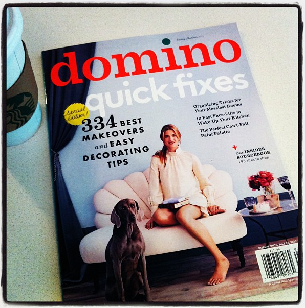
I picked up Domino mag today, can't wait to flip through every page and read every word! Hope you are enjoying your day:)
Monday, April 16, 2012
Master bath inspiration
As you know our bathroom will be under going some much needed updating and I've been busy putting together some ideas of how I want it to look and feel. I'm thinking white and classic with a hint of colour only through accents.
image from House Beautiful
image from House of Turquoise via Regina Garcia Design
Some options I'm thinking about:
Shower walls
Floor
Shower floor
Accent band on shower wall
Hardware option for vanity
Two mirrors for above vanity
Friday, April 13, 2012
What I'm Wearing
Trends
Mint green and floral pants
I wanted to try out two of the big trends this season and these pants just make me happy! Have a good weekend!
Mint green and floral pants
I wanted to try out two of the big trends this season and these pants just make me happy! Have a good weekend!
Monday, April 9, 2012
Time for a bathroom reno!
I am up to my eye balls in bathroom renovations right now so I might as well add my own bathroom to the craziness. I have an ensuite bathroom from hell and it's something that needs to be done whether this is our forever house or not. Drywall is starting to crumble off the ceiling in the shower and both sinks are starting to crack etc.... Let's just say that there is nothing appealing about this bathroom and I have lived with it for six years, six looooong years! I am going to do my best to keep the cost down as I am on a huge budget for this project. I need to be creative with where to spend and where to save and how to get the biggest bang for my buck! Oh and did I mention that it's a lovely Pepto Bismol pink? Yes, the walls, counter, trim and floor all in wonderful shades of pink. Back in the 80's it was the popular pinky beige. Kinda like the popular updated much nicer version we call greige so I guess that makes this colour peige??
One of the things I'd like to change if possible is the angled vanity. This is creating all sorts of problems for me. It will mean removing a closet in the kids bath but in the end it will be well worth it.
I have to live with the tub but I will break up the expanse of tile by adding some wood panelling to the apron and along the wall where the tile meets the windows. I am also adding some shelves on the wall to the right of the tub for towels etc...
The shower is a disaster! I am removing the wall where the towel rack sits and adding glass so it's open to the tub. In order to do this I have to move the shower head and add a rain shower head from the ceiling.
My doggie won't miss a photo opportunity!
I haven't decided on any of the finishes yet. But the overall colour palette will be white and grey with some much needed sparkle. I can't wait to get started!!
Saturday, April 7, 2012
Happy Easter!
My kids worked hard on these pretty eggs today and I wanted to share them with you. Hope you all have a wonderful Easter!
Wednesday, March 21, 2012
The versatile settee
A settee is one of the most useful pieces of furniture. It can be used at the bottom of a bed, in a dining room or eating nook, in a living room if space is tight, an entryway or even a wide hallway. It's on my list of must haves when we eventually move to a new house. My choice would be to have one in my entryway and have a cushy spot for my guests to sit while they put there shoes on and off. I am in love with the first image. Isn't it gorgeous?
Friday, March 16, 2012
What I'm wearing
Prints
I didn't think I was going to squeeze in this post today. It's been a crazy week with the kids being home on spring break, so much so that I had my nine year old daughter take these pictures! She's a budding photographer don't you think? I love mixing different prints, polka dots and animal print is by far one of my favourite combinations. If this is too much for you then try mixing on a smaller scale. What about a floral shoe and a striped shirt? Have a good weekend!
Boyfriend jeans from Gap, blouse from H&M, coat from Banana Republic, necklace from Spike the Punch, shoes from H&M
Thursday, March 15, 2012
Spring arrivals-Emerson Fry
I just love the new Emerson Fry spring collection! I signed up a few weeks ago to receive the spring preview and I'm loving some of the new pieces. I wish they weren't so expensive or I would be buying a few things right now! Here are some of my favourites.
Monday, March 12, 2012
Nudes
As much as I love colour I am drawn to these pale nude shades.
From left to right: blouse from Aritzia, Elle Decor, dress from Club Monaco, House to Home, dress from Ella Moss, Elle Decor
Tuesday, March 6, 2012
Powder room featured in BC Home Magazine
Check out my feature in the March/April edition of BC Home Magazine on how to make the most out of a small powder room. Just because it's small doesn't mean it can't be beautiful and functional!
Friday, March 2, 2012
What I'm Wearing
Brights
I love a bright pair of pants to liven up an otherwise neutral outfit. Have a good weekend!
sweater from Club Monaco, pants from Zara, shoes from Town Shoes, necklace from Stella and Dot, clutch from Zara
Thursday, March 1, 2012
Dreamy watercolours
I fell in love with this beautiful watercolour wallpaper from a company called Black Crow Studios. They are featured in the March edition of Canadian House and Home. It looks like a beautiful piece of art on your wall. If you didn't want to commit to wallpaper they will also mount it on canvas for you. I think it would be stunning on a dining room wall, don't you?
Tuesday, February 28, 2012
Sneak peek
A little sneak peek of a house I've been working on. This is a corner in their family room that has become a little reading nook.
Subscribe to:
Comments (Atom)


